



PRODUCT LAUNCH CAMPAIGN
LIVING IN A JELLY WORLD WITH KraveBeauty
KraveBeauty came to us to launch the Plumptuous Lip Jelly, their very first makeup product as a skincare-first brand. The goal: create a campaign that honored their skincare heritage while celebrating the playfulness of a bold lip moment. The result was a vibrant, multi-channel campaign that positioned KraveBeauty as an innovator, drove excitement for their entry into makeup, and gave their refillable lip oil a bold, memorable debut.
Objective
Services
Photo
Video
3D Design

A BOUNCY, FRUIT-FORWARD World
We brought the product’s personality to life through a vibrant creative direction full of playful energy and candid moments. Inspired by the product’s nourishing ingredients and fruit-forward shades, we leaned into a skin-first, approachable aesthetic that felt joyful and effortless, just like the product itself.


No. ① — CLOSE-UPS
INSIDE THE
Jellyverse
We designed a 3D world to immerse viewers in the Plumptuous Lip Jelly universe: a candy-like landscape of oversized guava, persimmon, and cherry elements reflecting each shade. At the heart of the visual identity is an animated plum character, a nod to the lip oil’s upcycled plum seed ingredient:bouncy, juicy, and full of personality.
No. ② — 3d design & animation
PLAYFUL MOTION,
Bouncy Storytelling
Through a mix of live-action and 3D animation, the campaign video introduced the lip oil’s innovation and modular refill system in a visually dynamic way. Quick cuts, upbeat pacing, and clever 3D transitions made the product feel as fun as it is functional, illustrating the refillable design and sensory payoff.
No. ③ — CAMPAIGN VIDEO


No. ⑤ — group lifestyle shot
No. ④ — INDIVIDUAL POSTERS

SKINCARE MEETS Statement Lips
Our photography heroed KraveBeauty’s skin-first ethos with natural textures, candid poses, and a playful edge, capturing effortless beauty momentsand bringing the campaign’s joyful, ingredient-driven narrative full circle.

Work

No. ① — 360 brand Launch

A 360 rebrand from full brand identity, to on-model and still-life photography, and an immersive custom beauty product user experience on the website.
No. ② — full brand identity
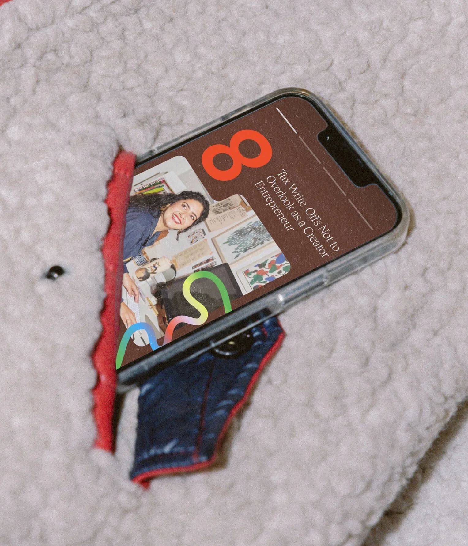
A colorful and vibrant brand identity for The Leap. Highlighting human connection and inspiring people to keep the journey exciting as they make the leap.
No. ③ — Custom Packaging

Rook & Rose is “not your average flower shop” – they carry a distinct confidence and bold personality. The Studio designed their expressive rebrand to reflect just that.
No. ④ — UX/UI

A dynamic, inviting, and fresh brand identity that emcompasses shared values of unfiltered self expression, authenticity and empathy.