redefining the diaper with Freestyle®
MODERN DIAPER BRAND
Objective
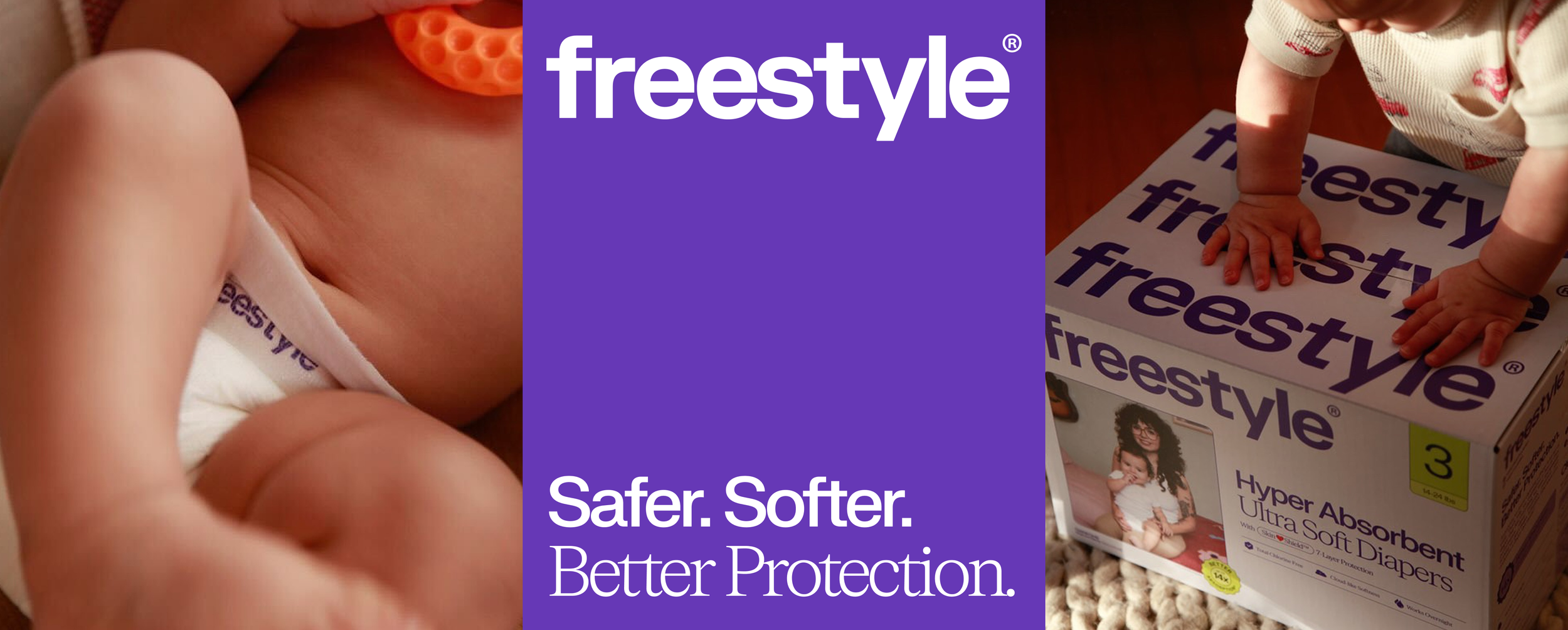
Freestyle® has been redefining the future of diapering since it’s birth (wink-wink) in 2020 by making hyper-absorbent, tree-free, bamboo diapers for modern parents. We worked with them hand-in-hand to refresh their branding, enhance their logo, craft a packaging system that’s both creative and cohesive, as well as extra collateral to make their launch in Walmart stores across Southern California a success.
Services
Brand Refresh
Logo Redesign
Packaging System
Brand Book
REFRESHED
LOGO Design
Cleaner logo = cleaner butts!? We started Freestyle®’s brand refresh with a logo that shows the brand’s growth and sophistication without sacrificing its playful, casual attitude. These are for the babies, after all!

No. ① — before

No. ① — after: UPDATED LOGO FOR FREESTYLE®
custom-fit
collection Logotypes
With Freestyle® specializing in 2 different diaper technologies, we crafted bespoke logos for each collection—SkinShield™️ and BambooTek™—making it easy for consumers to differentiate when shopping.

No. ① — SkinShield™ COLLECTION LOGO

No. ② — BambooTek™ COLLECTION LOGO

A NEW PACKAGING SYSTEM
FOR Walmart
With a huge Walmart launch on the horizon, we created a cohesive, creative, and colorful packaging system for Freestyle® and their many sizes, line items, and product lines.

SkinShield™ Packaging
The refreshed packaging system for SkinShield™ uses a clean, simple Frost White background with Deep Purple text, diversified with color-coded size tabs to differentiate packages from each other.
BambooTek™ Packaging
BambooTek™ packaging follows an inverse color system to SkinShield™, using Deep Purple for the background and Frost White for text throughout.

No. ① — REFRESHED PACKAGING IN ACTION

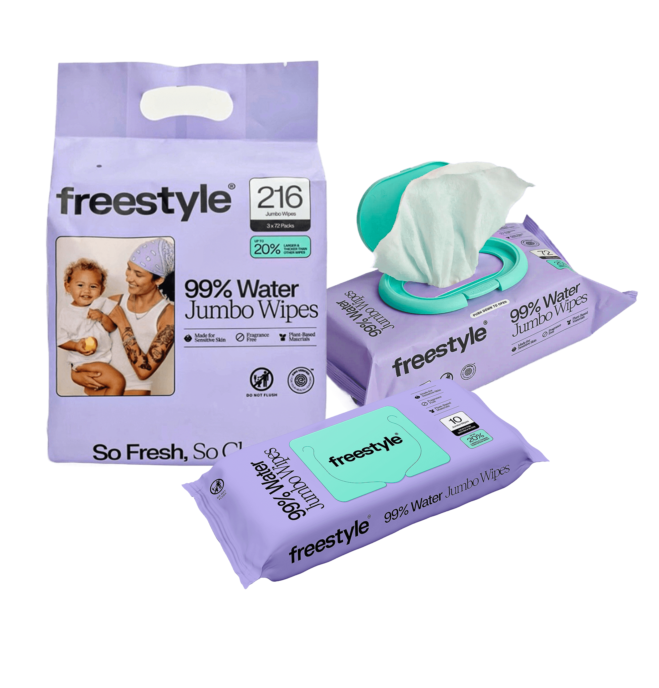
Wipes Packaging
We updated Freestyle’s bestselling wipes packaging by spotlighting teal and purple, colors that match anything kiddie.
SOCIAL Branding
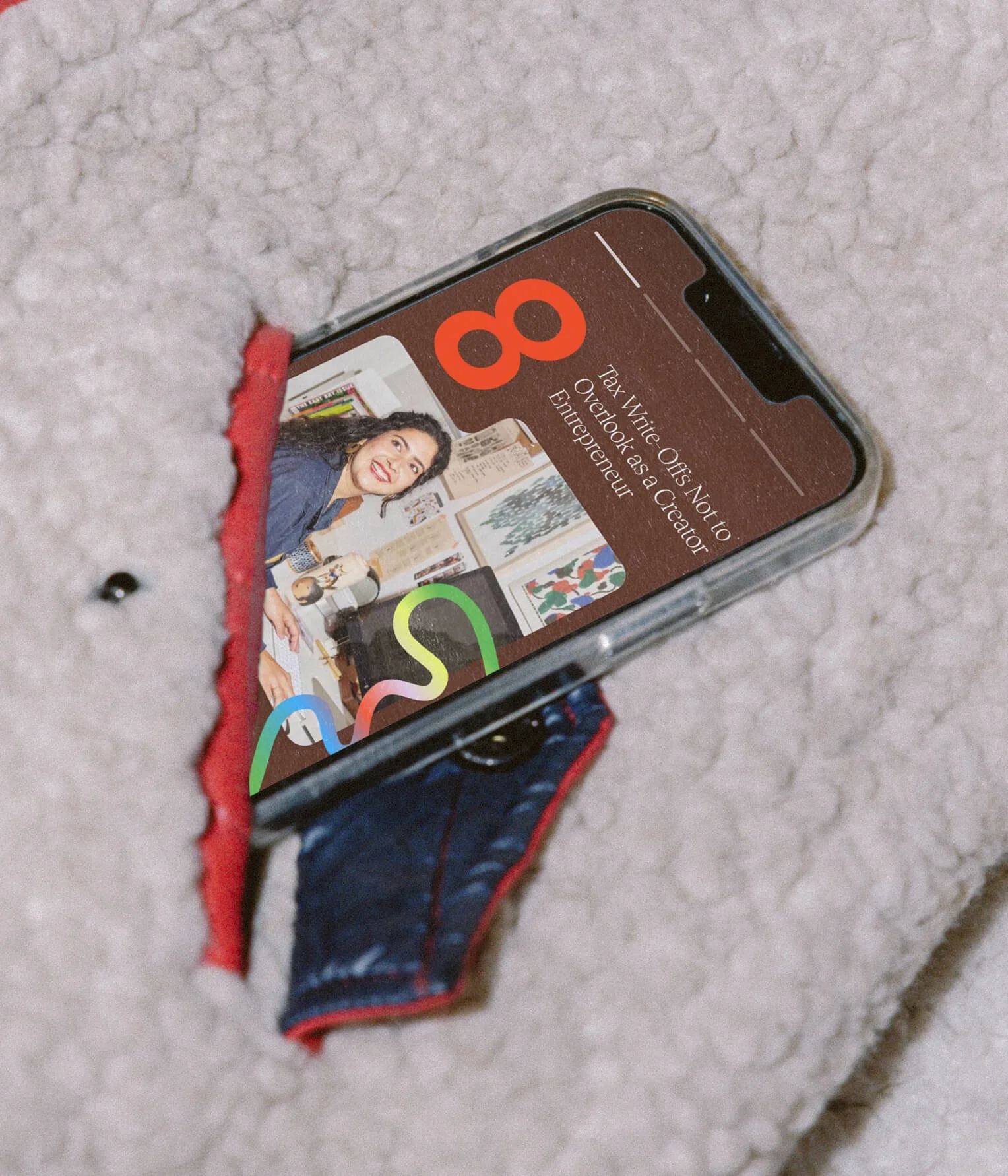
We refreshed Freestyle®’s branding to be more agile and flexible, ready to be used on all touch-points, digital and otherwise.

No. ① — SOCIAL STORIES

No. ② — SOCIAL STORIES
*ADDS TO CART*
at Walmart
In April 2025, Freestyle® finally launched in Walmart stores across Southern California, looking so fresh, so clean.
No. ① — NEW PACKAGING IN-STORE AT WALMART
PLAYFUL YET THOUGHTFUL COLOR Palette
Freestyle® needed a robust color palette to accommodate their sizing system and asset organization—and we delivered accordingly with a bubbly, matted pastel palette that creates differentiation without sacrificing brand cohesion.

No. ② — COLOR SYSTEM

No. ① — COLOR-CODED SIZE TABS

No. ③ — Competitive Advantage Badges
usp icon Library
We a crafted a small but strong icon library to communicate what stands Freestyle® out from the rest.
ENHANCED DIAPER
Illustration
To better visualize the innovative technology of Freestyle®’s SkinShield™️ diapers, we illustrated their diaper without missing a spot.


No. ① — NEW PACKAGING IN ACTION

No. ② — refreshed branding in action

We couldn’t let Freestyle® move on without letting them know how to use their fresh, new branding!
So they feel confident engineering the future of diapers without any visual roadblocks, we finished our partnership by crafting an all-encompassing brand book, complete with branding, social, digital, packaging, print guidelines, and more.
ALL-INCLUSIVE Brand Book

release & Relaunch
Freestyle®’s launch at select Walmart stores across Southern California was met with great engagement from existing and new customers alike.
Work

No. ① — 360 brand Launch
A 360 rebrand from full brand identity, to on-model and still-life photography, and an immersive custom beauty product user experience on the website.
No. ② — full brand identity
A colorful and vibrant brand identity for The Leap. Highlighting human connection and inspiring people to keep the journey exciting as they make the leap.
No. ③ — Custom Packaging
Rook & Rose is “not your average flower shop” – they carry a distinct confidence and bold personality. The Studio designed their expressive rebrand to reflect just that.
No. ④ — UX/UI
A dynamic, inviting, and fresh brand identity that emcompasses shared values of unfiltered self expression, authenticity and empathy.


